← Hans Sáenz · Work Book a diagnostic

Case · Brand platform

Rossa Cafe NYC

Mexican coffee and bread in midtown New York. A brand that does not adapt Mexico to the local palate: it brings it whole and makes it work in Manhattan.

Role
Brand direction
Scope
Platform · Positioning · Narrative
Sector
Coffee and bakery
Market
New York · Mexico
Year
2026
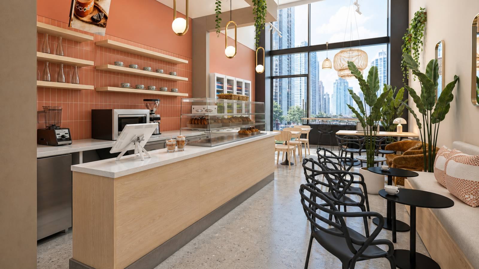
Rossa Cafe NYC, el local
Image 1 of 3img/caso-6.jpg · 1600×900
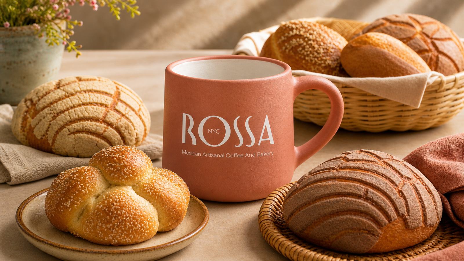
Rossa Cafe NYC, producto
Image 2 of 3img/rossa-portada-2.jpg · 1600×900
Rossa Cafe NYC, detalle
Image 3 of 3img/rossa-portada-3.jpg · 1600×900

01The brand

A coffee shop that joins borders

ROSSA is more than a coffee shop or a bakery: it is a cultural bridge between Mexico and New York. It offers authenticity, hospitality and contemporary design in one place.

It reads like a description. It is a decision.

Opening a Mexican coffee shop in midtown Manhattan means entering a category whose script is already written. There are two ways to fit that script, and both are traps.

The first is : sarape, papel picado, cantina lettering. It reads in two seconds and sentences the brand to being a stage set: somewhere you visit once, not somewhere you come back to on a Tuesday morning.

The second is : neutral specialty coffee, pale wood, Nordic minimalism, and the origin reduced to a footnote on the bag. It competes head-on with hundreds of identical shops and gives up the one thing nobody can copy.

"Cultural bridge" is the way out above both. And the three words that follow it are not decoration: each one covers a gap.

AuthenticityHospitalityContemporary design
02The idea

Do not translate. Build a bridge

Translation wears things down. The translator adapts the original until the other side understands it, and every adjustment gives something up: a nuance, a word with no equivalent, a custom that has to be explained before it can be enjoyed.

A bridge adapts nothing. , and whoever crosses it arrives at the other side, not at a polite version of the other side.

So Rossa does not explain Mexico to New York, and does not shrink to fit. It holds both belongings at once: for the Mexican it is memory and return; for the New Yorker, an open door.

A bridge does not pick a bank. It rests on both.

03The platform

What the brand says about itself

Purpose and promise come out of the bridge. This is not a copywriting exercise: it is the text everything else comes from: the menu, the shop, social media, and the conversation with a grower asking why they should sell their beans here and not next door.

Purpose

At ROSSA we believe coffee and bread are not just food, but .

We were born to be a bridge between Mexico and New York, a place where Mexican tradition blooms with modernity and where every cup evokes belonging, community and cultural pride.

Our purpose is to join borders through flavor, memory and Mexican hospitality, offering experiences that reconnect people with their roots while inviting the world to discover the richness of our culture.

The product

With beans meticulously selected from several regions of Mexico, we offer you a singular coffee experience that celebrates authentic flavors, aromas and traditions.

Every cup of coffee at ROSSA is not simply a delicious drink, but .

Two decisions hold that text up. First: origin is named by , not by country: Chiapas, Veracruz and Oaxaca have different profiles, and that detail is what separates pride from cliché. Second: , because the Mexican ritual is not a cup on its own, it is the cup and the pan dulce.

04Color

Roasted earth, not a flag

The palette is the first proof that the bridge is not folklore. No green-white-red, none of the cantina saturation: : the roasted bean, the clay, the skin of ripe coffee cherry.

They work equally well on a bag of beans, on a Manhattan storefront and on a screen, which is exactly what you ask of a brand that lives in two cities.

Terracotta
Pantone
7599 C
CMYK
0 / 59 / 72 / 25
RGB
191 / 79 / 56
HEX
#BF4F38
Coral
Pantone
7606 C
CMYK
0 / 49 / 45 / 11
RGB
227 / 122 / 110
HEX
#E37A6E
Cacao
Pantone
4975 C
CMYK
0 / 38 / 45 / 71
RGB
74 / 46 / 41
HEX
#4A2E29
Warm gray
Pantone
Warm Gray 4 C
CMYK
0 / 8 / 12 / 28
RGB
184 / 168 / 161
HEX
#B8A8A1
05The identity

Origin is written, not drawn

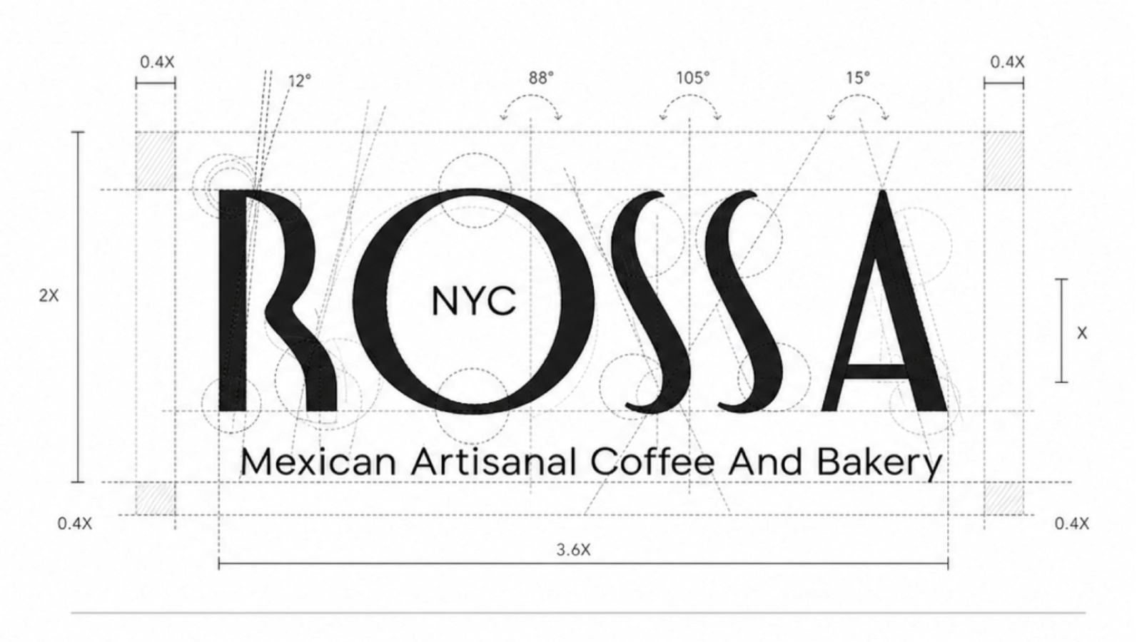
Rossa Cafe NYC · logotipo

The fastest way to make a Mexican coffee shop look Mexican is to draw it: a motif, a fret pattern, a flag palette. It is also the fastest way to turn it into a stage set.

Rossa does not have a single folkloric graphic element.

NYC lives inside the O.

The letterforms belong to both cities.

The descriptor in sans, so nothing sounds like nostalgia.

Color does the rest of the work, by the same rule: roasted earth instead of a flag. The four tones come from the product, not from the country.

06Applications

Where the bridge gets crossed

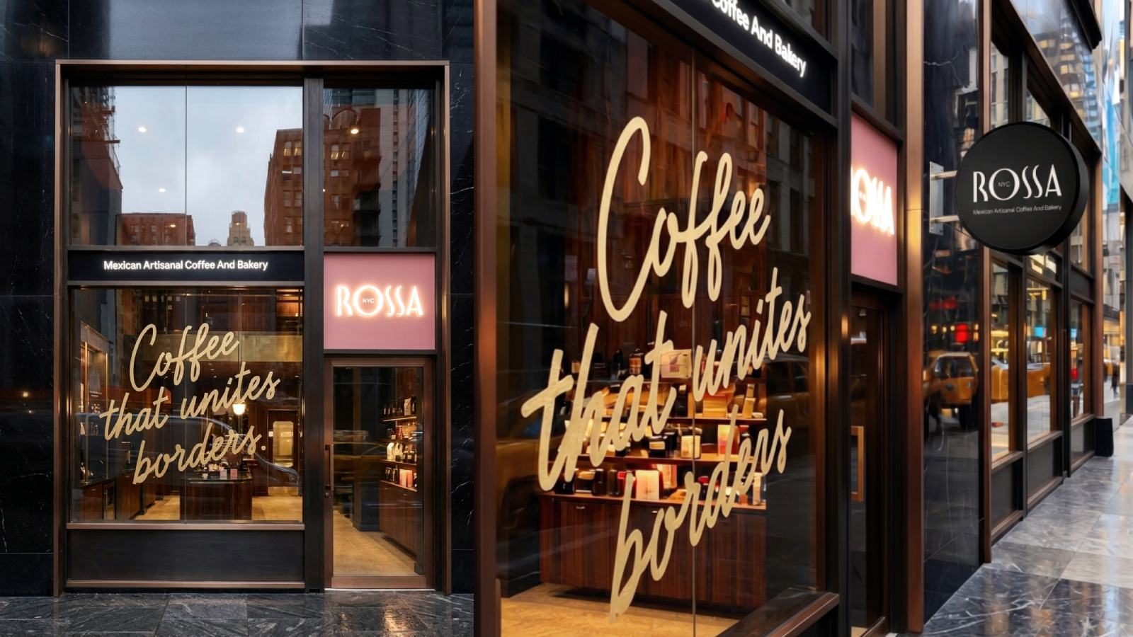
Aplicación de marca
Application 1img/rossa-apl-1.jpg
Aplicación de marca
Application 2img/rossa-apl-2.jpg
El local
The shopimg/rossa-local.jpg · 1600×900

Is your brand crossing borders without knowing what to bring from home? I review your position in 30 minutes.

Book a diagnostic